Plot.ly
Collaborative data science
Slides made with reveal.js
What is plot.ly
- Plotting library
- Online workspace:
- Publish
- Share
- Edit (Layout)
- Data + plots
- Library for Python, R, Matlab, Julia and JS (and Excel)
- Matplotlib and ggplot2 converters
- Works with numpy arrays and pandas dataframe in python
- Based on D3
Examples
Bar plot with error bars

Contour plot

Multiple histograms

Box plot

Polar chart

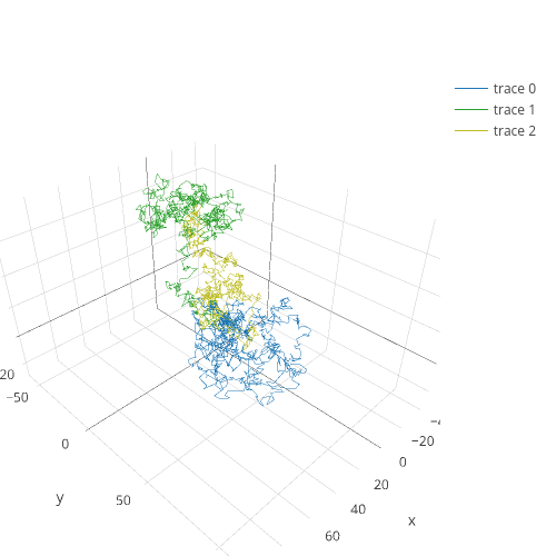
3d line plot
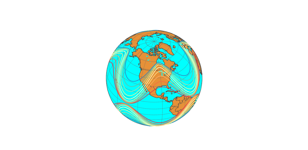
Maps API

Globe
Interactive 3d plot
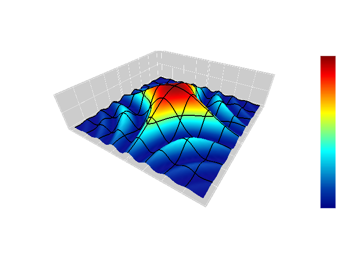
Data generation
import plotly.plotly as py
import plotly.tools as tls
from plotly.graph_objs import *
from numpy import pi, cos, exp

# Define the function to be plotted
def fxy(x, y, A=1):
    return A*(cos(pi*x*y))**2 * exp(-(x**2+y**2)/2.)

# Choose length of square domain, make row and column vectors
L = 4
x = y = np.arange(-L/2., L/2., 0.1)  # use a mesh spacing of 0.1
yt = y[:, np.newaxis]  # (!) make column vector

# Get surface coordinates!
z = fxy(x, yt)
10 lines of code
Plotting
data = Data([Surface(z=z, x=x, y=y)])
layout = Layout(title='$f(x,y) = A \cos(\pi x y) e^{-(x^2+y^2)/2}$')
fig = Figure(data=data, layout=layout)
py.iplot(fig, filename='s8_surface')
4 lines of code
Export to images

Export to images
https://plot.ly/~pydupont/1576/fxy-a-cospi-x-y-e-x2y22.png
https://plot.ly/~pydupont/1576/fxy-a-cospi-x-y-e-x2y22.pdf
https://plot.ly/~pydupont/1576/fxy-a-cospi-x-y-e-x2y22.svg
Export code
https://plot.ly/~pydupont/1576/fxy-a-cospi-x-y-e-x2y22.py
https://plot.ly/~pydupont/1576/fxy-a-cospi-x-y-e-x2y22.r
https://plot.ly/~pydupont/1576/fxy-a-cospi-x-y-e-x2y22.m
https://plot.ly/~pydupont/1576/fxy-a-cospi-x-y-e-x2y22.jl
https://plot.ly/~pydupont/1576/fxy-a-cospi-x-y-e-x2y22.json
https://plot.ly/~pydupont/1576/fxy-a-cospi-x-y-e-x2y22.embed
From a R ggplot2 plot
library(plotly)
py <- plotly(plotly_user, plotly_password)

library(ggplot2)
library(gridExtra)
set.seed(10005)

xvar <- c(rnorm(1500, mean = -1), rnorm(1500, mean = 1.5))
yvar <- c(rnorm(1500, mean = 1), rnorm(1500, mean = 1.5))
zvar <- as.factor(c(rep(1, 1500), rep(2, 1500)))
xy <- data.frame(xvar, yvar, zvar)
plot<-ggplot(xy, aes(xvar)) + geom_histogram()
py$ggplotly()  # add this to your ggplot2 script to call plotly
After changing the theme and adding a fit curve
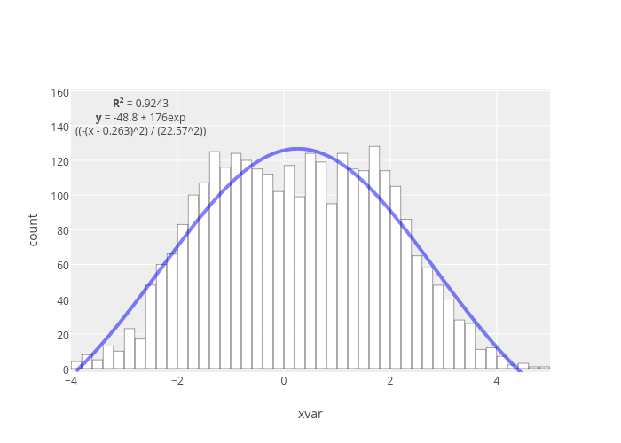
Layout
Original plot
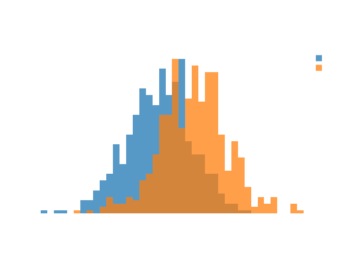
import plotly.plotly as py
from plotly.graph_objs import Histogram, Layout, Data, Figure
import numpy as np

x0 = np.random.randn(500)
x1 = np.random.randn(500)+1

trace1 = Histogram(x=x0)
trace2 = Histogram(x=x1)
data = Data([trace1,trace2])
py.plot(data, filename='overlaid-histogram')
Original plot

Layout changes
trace1 = Histogram(x=x0, opacity=0.75)
trace2 = Histogram(x=x1, opacity=0.75)
data = Data([trace1,trace2])
layout = Layout(
    font=Font(color='rgb(255, 255, 255)'),
    xaxis=XAxis(
        showgrid=False,
        zerolinecolor='rgb(255, 255, 255)',
        zerolinewidth=1.5
    ),
    paper_bgcolor='rgba(0, 0, 0, 0)',
    plot_bgcolor='rgba(0, 0, 0, 0)',
    barmode='overlay',
    bargap=0)
fig = Figure(data=data, layout=layout)
py.plot(fig, filename='overlaid-histogram-layout')
Layout changes
Conclusion
- Highly configurable
- Nice plots
- Free
- Connection with lots of languages
- Need an internet connection
- Some plots really long to load